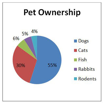

This is a pie graph. It is a circular graph that can also record something or people. This pie graph can be used for statistic maths. For example, the pie chart shown on the left. It represents the percentage of people who own pets. As you can see, the dog ownership' slice is by far the largest, which means that most people represented in this chart own a dog as opposed to a cat, fish, or other animal.


This is a Stem and Leaf Graph is a special table where each data value is split into a "stem" (the first digit or digits) and a "leaf" (usually the last digit). Like in the example above. It records something or people. It is to record your data and more.

A pictograph is a chart that uses pictures to represent data. Pictographs are set out in the same way as bar charts, but instead of bars they use columns of pictures to show the numbers involved.
This is a time series graph. It is similar to a dot plot graph but you just ad that one dot to your number as displayed above. After you done all of your answers you connect the dots and make a line, as displayed above.
No comments:
Post a Comment
Note: only a member of this blog may post a comment.